Did you know that 88% of online consumers are less likely to return to a website after a bad experience? This startling statistic is a wake-up call for businesses to prioritize their website’s usability and design.
Your website’s user experience is not just a component of customer satisfaction—it’s integral to how Google views and ranks your site. Emphasizing Experience, Expertise, Authority, and Trustworthiness (E-E-A-T), Google’s latest guidelines highlight user experience as a crucial ranking factor.
A user-centric design can boost engagement, lower bounce rates, and enhance overall performance.
In this post, we’ll discuss 10 outdated website elements that may be hurting your business and offer modern alternatives to improve your site.
1. Unclear Homepage Headers
Remove: Generic welcome messages like “Welcome to Our Website.”
Generic welcome messages do not provide visitors with meaningful information about your business. They fail to capture attention and communicate value, leaving visitors unsure about what you offer.
Use Instead: Clear, value-driven statements
Use clear, value-driven statements that immediately convey what your business offers and why it matters. For example, “Get Fresh, Organic Produce Delivered to Your Doorstep.” This approach quickly informs visitors about your services and encourages further exploration.
Why It Matters
Visitors often decide whether to stay on a site within seconds. A clear, compelling header can significantly increase engagement by immediately addressing the visitor’s needs and interests. According to a study by Nielsen Norman Group, users typically leave a webpage within 10-20 seconds, but clear value propositions can prolong their stay.
Examples
- Generic Header: “Welcome to Our Website.”
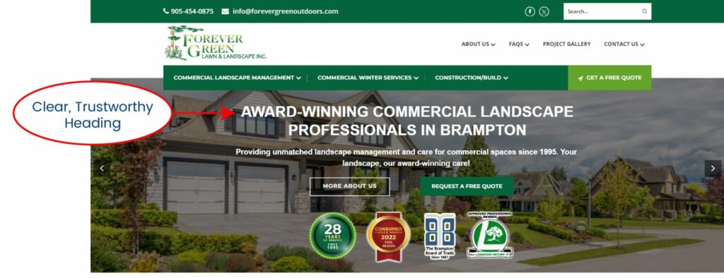
- Effective Header: “Award Winning Commercial Landscape Professionals in Brampton”

Pro Tip: Ensure your header reflects your unique selling proposition (USP) and aligns with your brand’s voice.
2. Generic Navigation/Menu Labels
Remove: Generic Menu labels like “Products” or “Services”
Generic labels like these are used on all websites and do not explain the products or services of the company at a glance. They lack specificity and fail to provide immediate clarity about what your business offers, making it harder for visitors to understand your site’s structure quickly.
Use Instead: Descriptive, intuitive labels
Use descriptive service or product category headings that give more clarity. For example, instead of “Products,” use “Organic Vegetables,” and instead of “Services,” use “Residential Plumbing Services.” Specific category labels give users a clear understanding of each section, reducing confusion and helping them find what they need quickly. This also benefits SEO by adding relevant keywords to your navigation.
A HubSpot study shows that 76% of consumers find ease of navigation the most important factor in a website’s design. Using clear, descriptive labels helps create an intuitive, user-friendly site that keeps visitors engaged longer.

3. Generic Subheadings on the Home Page
Remove: Uninformative subheadings like “Our Services,” “Testimonials,” or “Our Blog”
Generic subheadings like these fail to guide visitors effectively as they scroll down the page. They add visual noise without providing clarity or value. Such subheadings are also a missed opportunity for incorporating keywords, which are important for SEO.
Use Instead: Engaging, keyword-rich subheads
Use descriptive, keyword-rich subheads that clearly convey the content of each section. For example, instead of “Our Services,” use “Our Landscaping Services”.
Why It Matters
Subheadings are crucial for guiding visitors through your content and improving readability. They break up the text, making it easier to scan and understand. Well-structured headings enhance user experience and help search engines understand your content better, improving your rankings. According to a study by Moz, specific, meaningful subheadings can significantly enhance the user experience and boost SEO.
Examples:
Generic Subheading | Effective Subheading |
“Our Services” | “HVAC Repair and Maintenance Services” |
“Testimonials” | “What Our Happy Clients Say” |
“Our Blog” | “Latest Insights and Tips from [Industry] Experts” |
Pro Tip: Make sure your subheadings are specific and informative and include relevant keywords to maximize their impact on both users and search engines.
4. Homepage Slideshows
Remove: Rotating carousels that users often ignore
Rotating carousels are frequently overlooked by users after the first slide. Important information can be missed, search engines may not effectively index carousel content, and slideshows can slow down page loading times.
Use Instead: Static, compelling hero images
High-quality static images or videos can grab attention and showcase products or services more effectively. Ensure the top of the homepage is simple and descriptive, passing the “Five Second Test” by clearly stating what your business does.
Why It Matters
Static hero images with clear CTAs direct user attention and quickly convey the main message. They enhance user experience by avoiding distractions, improving load times, and boosting SEO performance.
Examples
- Rotating Carousel: Multiple slides showcasing different messages
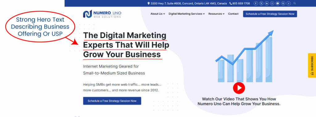
- Effective Static Image: One compelling hero image with a text like “The Digital Marketing Experts That Will Help Grow Your Business” with a clear CTA like “Schedule a Strategy Meeting”

Pro Tip: Make sure your homepage (Hero Statement) clearly states your business’s offerings, capturing visitor interest immediately and providing a straightforward path for exploration.
5. Stock Photos
Remove: Overused stock images that lack authenticity
Stock photos can make your website appear generic and insincere, which reduces trust and engagement. Visitors often recognize stock images, which can create a disconnect and make your brand seem less genuine.
Use Instead: Authentic, original photos
Use authentic, original photos of your team, products, or services to build trust and credibility. Showing real people and actual offerings behind your brand makes your website more relatable and trustworthy.
Why It Matters
Original photos personalize your brand and create a stronger connection with your audience. Authentic images enhance user experience and engagement by providing a real glimpse into your business. According to a study by Venngage, authentic visuals are 40% more likely to be shared on social media, amplifying your reach.
Examples:
- Stock Photo: A generic image of workers
- Authentic Photos: See how the pavement company (Sure-Seal Pavement Maintenance Inc.) is showcasing real employees and their equipment, highlighting the genuine aspects of their business and fostering trust and engagement.

Pro Tip: If a professional photoshoot isn’t feasible, use your smartphone to take high-quality photos. Ensure good lighting, clear focus, and natural settings to capture the essence of your business authentically. These images can be used across your website, social media, and marketing materials to maintain a consistent and authentic brand image.
6. Social Media Icons on Key Pages
Remove: Distracting social icons that lead users away from your site
Social media icons on key pages can distract users and lead them away from your website, reducing engagement and conversion rates. When users click these icons, they often leave your site and may not return, which impacts your overall site performance.
Use Instead: Focused call-to-actions
Use focused call-to-actions (CTAs) that keep users engaged with your content. Encourage actions like “Sign Up,” “Learn More,” or “Get a Quote.” Place social media icons in less intrusive areas, such as the footer or the contact page, where they are less likely to distract users from the main content.
Why It Matters
Keeping users on your site longer increases the chances of conversions and deeper engagement. A study by Kissmetrics shows that reducing distractions can improve user experience and conversion rates.
Pro Tip: Make your primary CTAs prominent and compelling. Ensure social media links are accessible but not competing with your main objectives on key pages. This strategy maintains user focus on your site’s goals, enhancing engagement and conversion rates.
7. Long Paragraphs
Remove: Walls of text that can be overwhelming
Long paragraphs can be overwhelming and difficult to read, especially on mobile devices, leading to higher bounce rates. When users are faced with large blocks of text, they are more likely to skim through or leave the page altogether, reducing engagement and effectiveness of the content.
Use Instead: Short, scannable paragraphs
Use short, scannable paragraphs with plenty of white space to improve readability and user engagement. Break up your text into smaller sections to make it more digestible. Use bullet points, subheadings, and concise sentences to ensure the content is easily accessible and inviting to read.
Why It Matters
Readability is a key factor in user experience. According to a study by the Nielsen Norman Group, users typically read only 20% of the text on a web page. Making your content scannable increases the chances that users will absorb the information you want to convey. Improved readability also enhances the user experience, which can lead to lower bounce rates and higher engagement.
Examples:
- Long Paragraph: “Our company provides a wide range of services including but not limited to residential and commercial plumbing, HVAC repair and maintenance, and electrical installations. Our team of experienced professionals is dedicated to providing top-notch service and ensuring customer satisfaction. We use the latest technology and equipment to diagnose and fix issues quickly and efficiently. Our goal is to provide high-quality services at competitive prices.”
- Short, Scannable Paragraphs:
- “Our company offers a wide range of services:
- Residential and commercial plumbing
- HVAC repair and maintenance
- Electrical installations
- Our experienced team is dedicated to providing top-notch service and customer satisfaction.
- We use the latest technology to diagnose and fix issues efficiently.
- Our goal: High-quality services at competitive prices.”
- “Our company offers a wide range of services:
Pro Tip: Aim for paragraphs of 2-3 sentences. Use bullet points and subheadings to break up information. This format is not only more readable but also more likely to keep users engaged and on your site longer.
8. Testimonials Page
Remove: A separate testimonials page that users might skip
A separate testimonials page is often overlooked by users, which reduces the impact of your customer feedback. When testimonials are isolated on a single page, visitors may not take the extra step to view them, thus missing out on valuable social proof.
Use Instead: Integrate testimonials across your site
Integrate testimonials throughout your site, especially on product and service pages. This approach ensures that positive customer feedback is visible when and where it’s most relevant, enhancing trust and credibility at critical points in the user journey.
Why It Matters
By embedding testimonials within various sections of your site, you provide continuous validation and build trust with potential customers. According to research by BrightLocal, 82% of consumers read online reviews for local businesses, and integrating testimonials can significantly influence purchasing decisions.
Pro Tip: Use a combination of text and video testimonials to cater to different preferences. Displaying testimonials near CTAs (call-to-actions) can also boost conversions by reinforcing trust at decisive moments.
9. Auto-Play Videos
Remove: Videos that play automatically with sound, often annoying users
Auto-play videos with sound can be disruptive and annoying, leading to a poor user experience. Users often find it jarring when a video starts playing unexpectedly, causing them to leave the site quickly.
Use Instead: User-initiated video play with muted auto-play
Allow users to choose when to play a video, with the option to start muted auto-play. This approach respects the user’s control over their browsing experience, enhancing engagement without disruption.
Why It Matters
User control is crucial for a positive browsing experience. According to a survey by HubSpot, 82% of respondents found autoplay videos with sound to be an annoying feature. By allowing users to initiate video play, you provide a smoother, more pleasant interaction.
Pro Tip: Place videos strategically near relevant content and ensure they complement rather than interrupt the user’s journey. Clear CTAs can encourage users to watch without forcing the content upon them.
10. Intrusive Pop-Ups
Remove: Aggressive pop-ups that disrupt user experience
Aggressive pop-ups can be intrusive and disrupt the user experience, leading to frustration and higher bounce rates. These pop-ups often appear immediately and cover significant portions of the content, pushing users away.
Use Instead: Subtle, timed pop-ups or slide-ins
Subtle, timed pop-ups or slide-ins that appear after the user has had some time to engage with the content provide value without being intrusive. This approach improves user experience while still capturing leads and engaging users effectively.
Why It Matters
Non-intrusive pop-ups enhance the user experience by respecting their engagement with the content. According to a study by Sumo, well-timed pop-ups convert 9.28% better than intrusive ones.
Examples:
- Intrusive Pop-Up: A pop-up that appears immediately upon page load, covering the entire screen.
- Subtle Slide-In: A slide-in that appears after 30 seconds of user interaction, offering a newsletter signup.
Pro Tip: Use exit-intent pop-ups that appear when the user is about to leave the site. These can effectively capture leads without interrupting the browsing experience.
Conclusion
Replacing outdated website elements with modern alternatives can significantly enhance user engagement, improve SEO, and contribute to a more professional, trustworthy online presence. By focusing on user-centric design, your website will not only look better but also perform better, driving greater satisfaction and conversion rates.
Ready to bring your website up to date? Use this checklist to audit your site and identify areas for improvement. For further expert advice and assistance, contact our team today. Let’s make your website a powerful tool for your business success!


